This week: a guest post by Hilary Niles, a data freelancer based in Vermont.
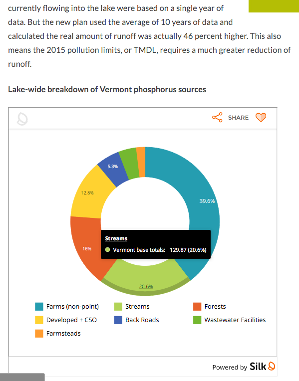
I first flagged Silk as a platform for making simple data visualizations mock-ups. Turns out, Silk is great for publication, too.
It took me a while to get used to how it structures data, but overall I found the effort well worth it. Here’s why:
– nice design out of the box
– good range of templates, from stacked bar charts to scatter plots
– back-end and front-end filters
– ability to add users with different permission levels to a project — and they don’t have a have a Silk account
– widely usable iframe embed code
– robust capability for building out entire projects
It embeds in both WordPress and Core Publisher (a CMS used by many NPR affiliates), whereas other visualization tools don’t work well with many common scripts running other visualization programs.
That said, Silk isn’t perfect: It’s missing certain bells & whistles for customization, and t’s pretty clunky to edit your data once it’s uploaded, which can be a drag. And the interface is not without its bugs; it’s a new company, and they’re still fine-tuning their code.
But the nice aesthetic, wide-ranging usability, and amazingly responsive service through their “Help” chat definitely will bring me back. The folks in the newsroom I used as my Silk guinea pig were happy with it, too. They may even go on to deploy it for everyday use beyond the big projects (like this one) we do together.
P.S. And it’s free! (At least for now, while they figure out their business model.)

