And woah nelly, is WTFcsv a good one. CSV stands for “comma-separated values” (e.g., a spreadsheet), and WTF stands for, well, you know.
WTFcsv makes a little chart out of each column in your spreadsheet. With some columns, this doesn’t make any sense, but with others, it can make it terrifically easy to spot a story. For instance, look at this NYPD arrest data I had on hand:
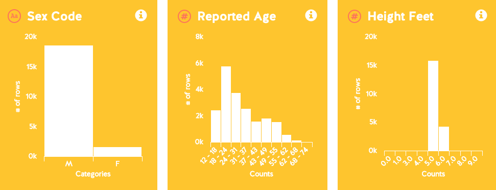
The “Arrest Date” and “Arrest Time” charts don’t really make any sense, but the race one seems about right. Then you look down to Sex, and holy moly! Something like 90% of arrestees are male.
Now, this tool comes with a HUGE caveat: you have to actually look at the data, verify and analyze it before you use it for a story. Clicking “What do I do next?”, just below the intro text, gives you a few suggestions:
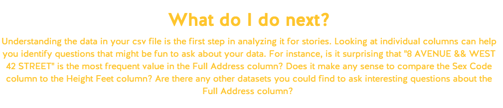 Look at that, they’re even giving me story ideas! Times Square is the most common location for arrests. Or, rather, it might be. I need to check the data myself, probably using a Pivot Table, and then call up the NYPD themselves. There’s also probably a ton of story ideas in that data that WTFcsv is missing.
But it’s still an awesome tool for someone who’s afraid to dive into data, or just short on time, or just wants to take a casual glance at a spreadsheet before moving on. Bit by bit, we’re all going to be data journalists before you know it.