I actually interviewed the creators of this week’s tool (seriously, do you see what I do for you guys) and it’s pretty gat dang impressive.
When I’m using data for a story, I mainly use Excel – it’s all you need – but if it’s especially large or annoying, I also use SQL and/or viz tools. This one does it all! Or, almost all.
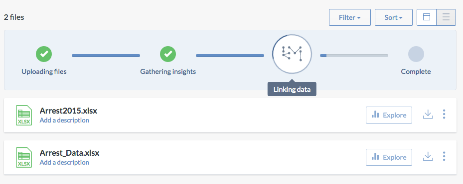
It’s called data.world and it’s what the AP uses for sharing data with its local outlets. That’s cool enough on its own, but data.world also combines multiple (and powerful) data tools in a way I hadn’t seen before. The other day I had to clean, analyze and visualize a data set and data.world could do almost all of it.
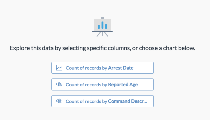
For example, it has an Explore function like Google Sheets, but it keeps going when Sheets collapses under the weight of 109,000 rows.
Even if you’re not super on the data train yet, like if you’re wondering what I’m talking about, you might want to keep data.world in mind. They offer collaboration, publication and other features I haven’t gotten to, so I wouldn’t be surprised if it comes in handy sooner or later.


