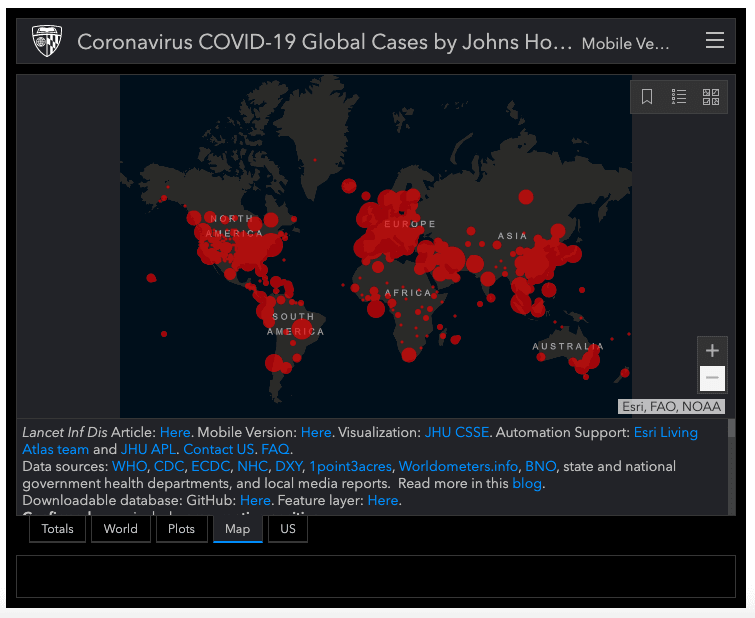
In case you haven’t seen it, the Johns Hopkins dashboard on coronavirus information is very detailed. Things are changing very fast, so constantly making updated charts and maps might not be the best use of your time. Instead, consider embedding the JHU dashboard.

You can embed this interactive dashboard (containing maps, lists, and graphs) by copying and pasting this simple code:
<iframe src=”https://coronavirus.jhu.edu/map.html” width=”100%” height=”500″></iframe>
Resized it by changing the width and height numbers you see in there. It might a good way to let your audience stay on top of numbers while you focus your time elsewhere. And stay safe out there!