A popular way to visualize some election data is a horserace, or, more elegantly, a “line chart race.”
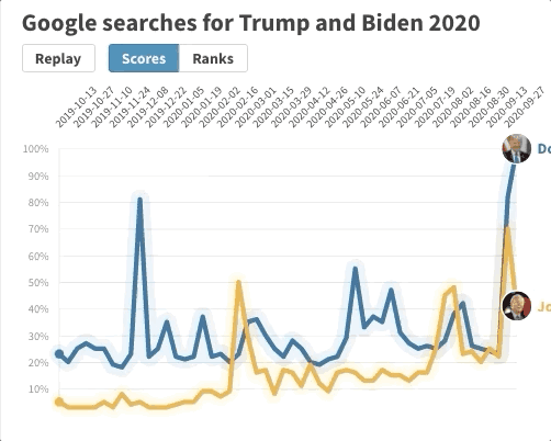
You can make one (kind of) easily with a dataviz tool called Flourish. Flourish offers a bunch of animated graphics, including the line chart race, that I’ve seen used more and more frequently lately.
The tool is free as long as you make your data public. If you work at a newsroom, you might qualify for a free premium account that would allow you to make private visualizations.
You can make an easy line chart race with Google Trends data, or Coronavirus cases, or anything that tracks the amount of something over time. Gathering this data, and squeezing it into the finicky Flourish, is probably the hardest part.
As for the end product, well, it looks uncomfortably close to everybody’s spiking heart rates, but it certainly catches the eye. Here we go!