I’ve thought about sharing Google Trends Insights on here before, but they haven’t necessarily been updated regularly, so I worried they weren’t evergreen enough. But! The Olympics is Insights’ time to shine.
You may already be familiar with Google Trends – the giant, absurdly detailed database of Google searches that you can map and graph. Insights are basically custom-made Trends visualizations that you can embed with just two clicks.
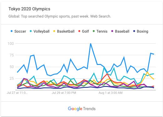
The Olympics are a perfect use case because Trends are the right kind of “vibe” if that makes sense. The vizzes are stuck in Google’s Red/Blue/Green/Yellow color scheme, which might come off as too silly for some more serious topics, and they’re not very editable, either.
But it’s a great way to inject color and interactivity and into your story with practically zero time or effort on your part. That and they’re fun to look at! Right now, Trends is offering free Insights visualizations on Covid, wildfires, the #StopAsianHate hashtag and several other topics. The Trends team updates them somewhat regularly.
Just remember that Trends only graphs the number of Google Searches. So, not necessarily a sport’s popularity, or how controversial it is, or anything else. Happy Olympics! 🤸